Sugamo Shinkin Bank / Niiza Branch
Saitama, Japan
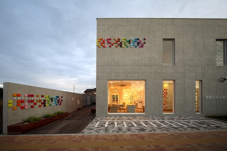
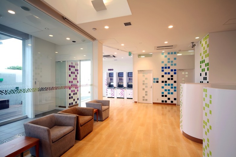
This project sought to create a whole new look that refreshes the current image of this financial institution. For their new 43rd branch, we redesigned not only the interior, but also Sugamo's brand image, including its facade, logo graphics, signage and brochures. The key concept revolves around squares - besides incorporating square shapes, the building was conceived as a sort of public square where people gather. The colors of these squares play an important role: the logo on the facade of the building features as many as 24 colors visible from the main street, becoming a symbol for the area. These colors welcome customers as they enter the building, continuing on the inside and serving as natural dividers between lobby, meeting space, ATM and so on.


- Architects
- emmanuelle moureaux
- Location
- 新座市野火止6-1-31, 352-0011 Saitama, Japan
- Year
- 2009